
Adding Value for Truck Owners
To determine what sorts of features a food truck owner would find useful, I spent many afternoons and cold evenings going out to food truck parks and interviewing the owners as they were closing their trucks up for the evening. From a few early sessions I decided that it was easier for them to take some time to participate at the close of the shift, when they no longer had to worry about customers at their window or managing food. I recorded their responses and emails in a Google form that I could fill out from my phone as I discussed with them. I considered recording them with the voice memos app on my phone, but decided it would be too invasive to bring up with a brand new acquaintance. My questions were formulated to get honest answers without immediately letting the interviewee know that I was looking to solve a problem. This was so that my interview responses would be diverse and unsullied by my own bias.
Mass social posting was shown in my research to be a great introductory distinguishing feature to draw in owners, but to keep them consistently publishing a location for every serving session, I had to make that publishing function very simple, a one-tap-wonder. Unlike other food truck apps, TruckStop will log each serving location you publish, and start to learn the ones your truck most frequently serves at. If the app recognizes that you're super close to a location you've frequently served at before (i.e. within 50 feet of a logged location) it can prompt you with a reminder notification that asks if you're serving and would like to publish. This keeps the process to publish your location down to a single tap, with the option to take further publishing action (social media postings) after a session has been opened.

This way, publishing your serving session takes a minimum amount of time and effort and can easily be prompted even without the user needing to enter the app. On biometric-enabled devices, the user can opt for an additional step that adds a second layer of authorization.

Automatic Un-Publish
If they don't opt to set a closing time on their Activity page, owners can enable a feature that automatically un-publishes the session if their phone strays more than a quarter mile from the coordinates it opened the serving session with. This allows the owner enough freedom to leave the truck and go to the bathroom or run across the street, without accidentally un-publishing their session. When they're done serving they can just pack up and leave, no un-publish action required.

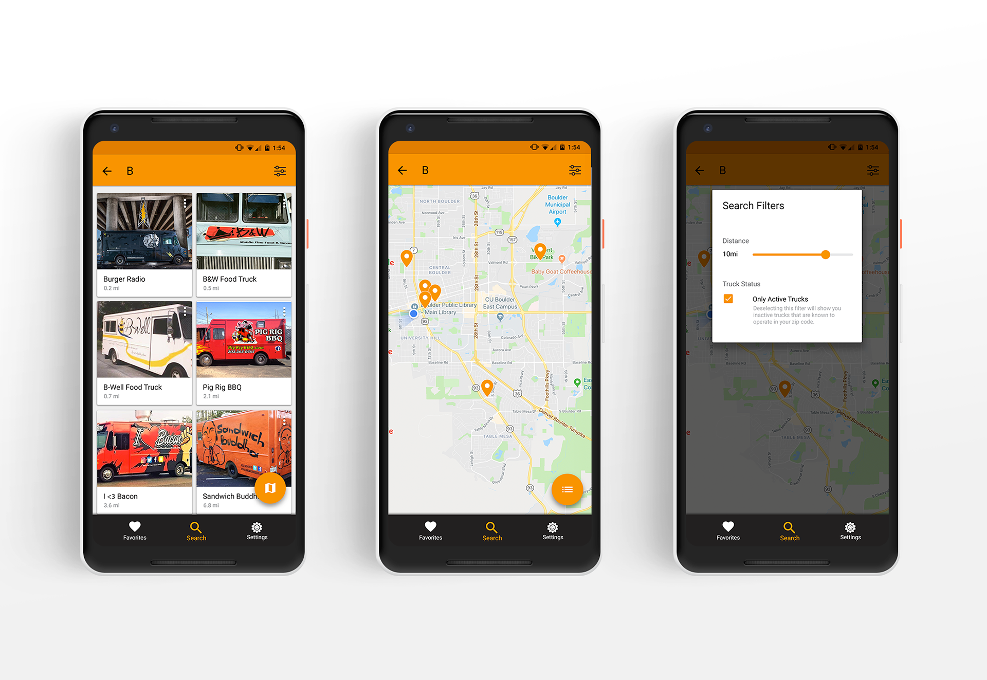
The traditional model of searching for a food truck involves getting all the information required to make a visit decision from 3 primary sources: social media, the truck's site, and their posted locations (Trucks' actual location posts are infrequent, and hidden among posts about their menus, customers, awards, and all else)

Giving owners a way to port all of their truck information to a single source simplifies the search process for the patron and removes the cross-referencing that takes up so much time. It also allows the owners to manage a single source of information that can then update the three channels above.
Adding Value for Patrons
For truck patrons, the issue I set out to solve was to eliminate as much cross-referencing as possible between media platforms and instead provide the information necessary to make a decision to visit. After interviewing and recording my own personal search experiences, I determined these criteria to be:
Location: The prime filter, as anything too far away is simply too much of a hassle to visit.
General Info: Self-description, photos, social accounts, etc...
Menu: What type of food do they sell, and how much is it?
Location, Location, Location
The prime search screen of TruckStop has two basic ways it prioritizes results: Trucks that are currently active are bumped to the top of the list, and sorted according to their distance from the user. Since this parameter is the prime eliminator for most trucks (i.e. too far or not serving), it's used as the prime search filter
Because the results for trucks had the potential to be quite simple and photo-heavy, I decided to use Material Cards for the Android version.
General Info
Once a user is in a truck's detail page, they're presented with a few tabs that offer information important for a decision, the first of which is the basic information about the truck. To speed up the search process, trucks descriptions are limited to 280 characters like Twitter, to allow a user to get a nice summary in just a few seconds. The section also presents some basic info on how to learn more and contact the truck, a feature that would be important to publicize to get truck owners to create an account. Through research I've discovered that trucks pull in their easiest money through catering gigs, so a future feature would take the contact info a step further and allow you to quickly coordinate catering for an office or party.
In the About and Menu tabs, the FAB adjusts according to the most relevant primary action for each page. The About page prioritizes the serving info if the truck is active, pinning it to the top of the top card.

Menu
The truck profile also presents the user with a simple version of the menu, with the item descriptions limited to 140 characters for quick scanning and decision making. Once a user finds a truck that looks interesting, they can immediately view the the menu to check pricing and cuisine options. I considered having the layout automatically sort menu items within their category by price, lowest-to-highest, but discovered through in-person research that owners would prefer to have control over their menu order because of the way they frequently pair items or base one menu item as a variation on the item above it.
Custom Iconography
For the most part I was able to find default Material Design for almost every need I had. I like to use default system icons whenever possible to present the user with familiar symbology and axioms for navigation. However, the designer in me saw an opportunity to get creative, and I decided to make two playful custom icons that clearly illustrated what their respective option in the bottom bar was for. These were on the Material Design System Icon Grid in order to help them fit with the other material icons already being used in the app.

Optical Adjustments
Although the primary interface color looked great across almost all placements in the app, I felt that its contrast with the black bottom bar could be slightly boosted, so I chose a slightly modified version that was shifted more into the yellow/white area of the color wheel to stand out more against dark backgrounds.